Video file
Empowered by Design & Updating Everything | The Key Visual Design in the Design Impression · Qingdao Design Festival 2022
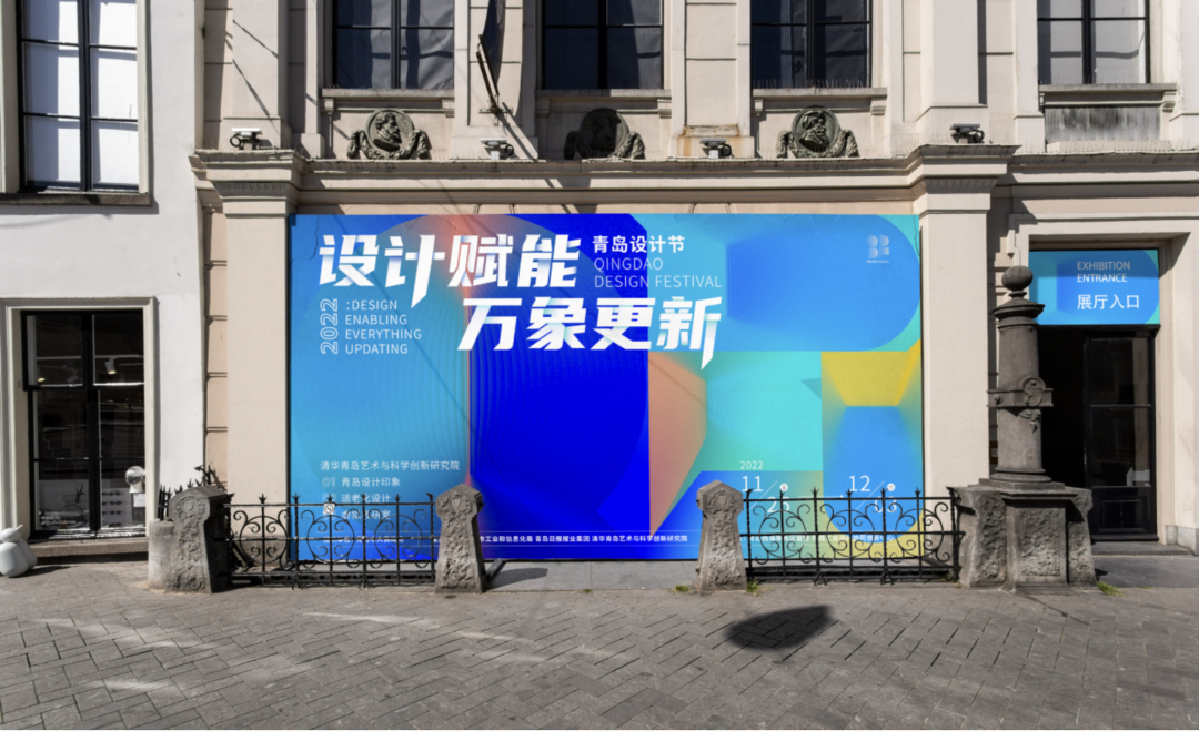
The Design Impression · Qingdao Design Festival 2022 was unveiled on November 29, 2022. Under the theme of "Empowered by Design & Updating Everything", this design festival aims to provide vitality of innovation and power of design to the quality development of the manufacturing industry by driving industrial upgrade through design with the support of innovation, and to revitalize and empower the city and serve the people's livelihood in Qingdao. The visual design of this festival is performed by Tsinghua (Qingdao) Academy of Arts and Science Innovation Research.
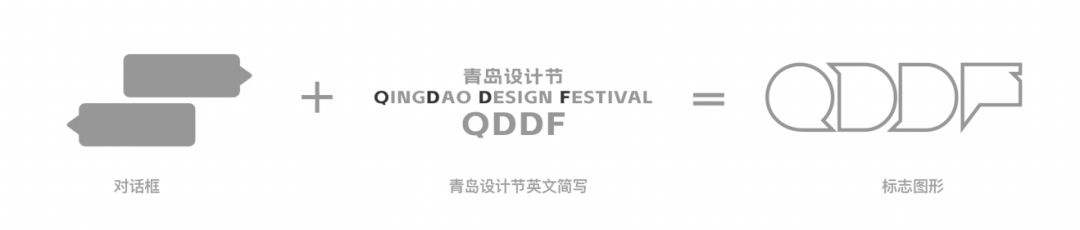
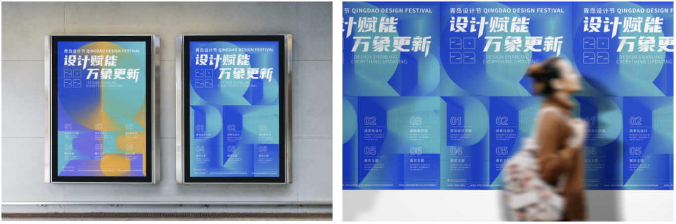
The logo of this design festival takes "dialogue" as its symbol, which aims to assimilate the design into a language of exchange and dialogue. As a language, design can be used by a designer as a conversation with life, by an industry to link with the market, by a consumer to follow the new times, and by a city to integrate into the world. The Qingdao Design Festival, a platform that is divided into six sections including "design competition" and "design exhibition", focuses on establishing an exchange platform between the industry and the academy. By doing so, it can extend the boundary of design to lead into and discuss some social dialogues with the wisdom of design that is thoughtful, independent and insightful and to show the world Qingdao's philosophy on design.
That's the inspiration for designing the festival logo, which integrates the dialog box with "QDDF", the abbreviation of "QingDao Design Festival". The pattern of the logo represents that people are able to use their unique design language to have dialogues with all things on earth and with the future through the platform of the Qingdao Design Festival.
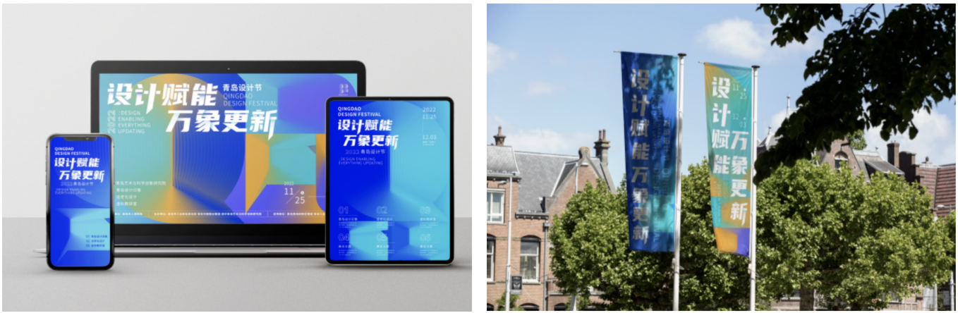
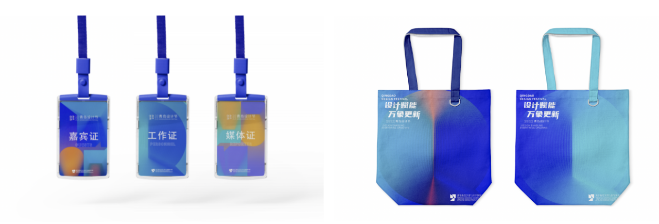
With the scientific purple-blue as its main color, and embellished with water blue and tile red, the logo stands for the foresight of the festival to cultivate the new energy of the industry, drive the updating of the industry, and develop a new pattern for the industry, and the beautiful environment and regional features of the azure sea, red tile, and the blue sky of Qingdao.
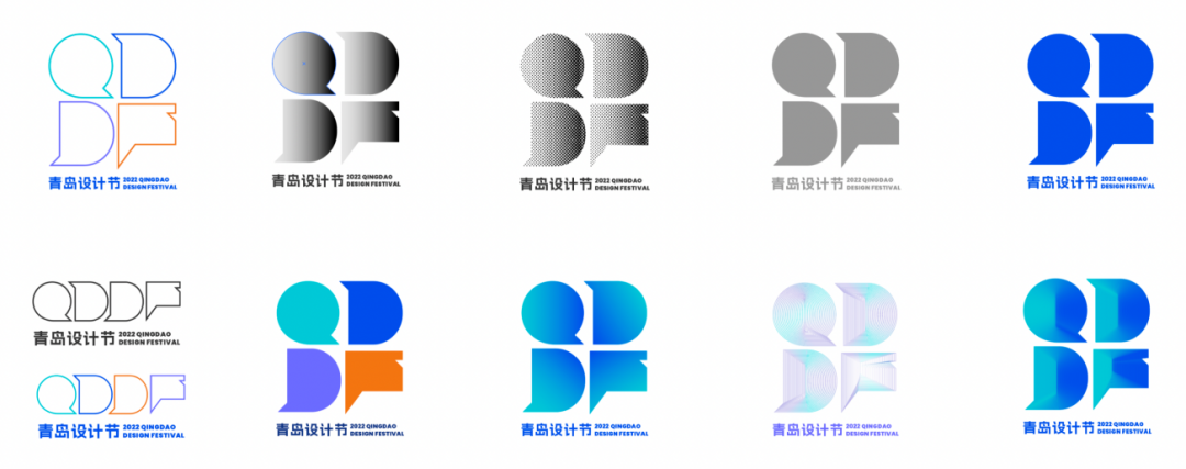
。Based on the logo, there is a design extension through the auxiliary graph. By using light and color to break the border of the four pattern units of "QDDF" in order to shape a layered and ordered comprehensive world, which means that although the design is voiceless, it links all things of the world, extends the current boundary, and provides infinite power to cities, lives, and times, as the theme of the festival says: Empowered by Design & Updating Everything.
During the opening video of the Qingdao Design Festival, the designer makes a stereoscopic model of the four units of "QDDF". It shows that design is a language of communication and seems like a glass-made transparent container that is empty but refuses nothing. It means that all things in the world referring to dining, dressing, housing, transportation, and information transmission must rely on design.
All "containers" in the video are ready for welcoming all talents and thoughts from excellent design teams and individuals to work together to carry out the "Qingdao Design Festival", a grand visual event that integrates culture, arts and science.
Members of the visual design group
GE Jing XU Ying SHU Xiaomeng JIANG Yahui LI Xiaokun DONG Fujia